Image Styling Options
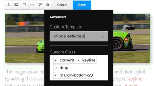
The image above has been added with an Image Block, and then styled by adding custom classes via the 'Design & Custom Template' option as follows: 'corner8' (rounds the corners by 8px), 'keyline' (adds a thin grey border), 'drop' (adds a drop-shadow), and 'margin-bottom-20' (adds a 20px space beneath the block). The following screen-shot shows the styles added...
Using an Image Block is the best way to add pictures to a page, but text cannot be run around the image. For that you need to use a Content Block as per all the following examples.
The image above has been inserted into a Content Block. It has no styling classes assigned so it fills 100% of the block's width and is otherwise styled as the designer intended. For technical reasons, this example would be much better added as an Image Block.
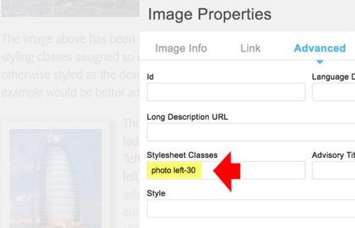
The picture on the left has been added to a Content Block and then assigned classes ('Stylesheet Classes') of 'photo' (adds a white border and a drop-shadow) and 'left-30' (gives it a width of 30% and aligns it left). Note how the text wraps around the image. The text was added first, then the curser was positioned immediately to the left of the words 'The picture on the left...' before clicking the image icon in the block control menu. The following screen-shot shows the styles added but note that the 'Advanced' tab has been clicked...
The image above has classes of 'tilt-r' (tilts the image slightly to the right), 'keyline' (adds a thin grey border), and 'mid-50' (gives it a width of 50% and aligns it centrally). Note that text will not wrap around centrally-aligned images as this would make it difficult to read.
The image on the right has classes of 'tilt-l' (tilts the image slightly to the left), 'drop' (adds a drop-shadow), and 'right-50' (gives it a width of 50% and aligns it to the right). Note that images set to a proportional width of the block will remain at that proportion even when viewed on a phone, which can then make them too small to see any detail.
In this section:
The image above has been added with an Image Block exactly as per the example on the left, except that the image has been made into a link to another page, and given an overlay on the hover by selecting a Custom Template (see illustration on the left) called 'With Overlay'.
The available image styling options or 'classes' are as follows:
- 'photo' - styled like a photograph on the page
- 'corner0' - square corners (no rounding)
- 'corner8' - rounded corners (8px)
- 'img-circle' - cropped into a circle or eclipse
- 'tilt-r' - tilted to the right
- 'tilt-l' - tilted to the left
- 'keyline' - given a thin grey keyline border
- 'drop' - given a drop-shadow
- 'clear-md-tb' - space added: 20px top, 30px bottom
- 'clear-sm-tb' - space added: 10px top, 15px bottom
- 'full-100' - 100% full width of block
- 'left-70' - alligned left, 70% width
- 'right-70' - alligned right, 70% width
- 'mid-70' - centre alligned, 70% width
- 'left-50' - alligned left, 50% width
- 'right-50' - alligned right, 50% width
- 'mid-50' - centre alligned, 50% width
- 'left-30' - alligned left, 30% width
- 'right-30' - alligned right, 30% width
- 'mid-30' - centre alligned, 30% width
- 'left-15' - alligned left, 15% width
- 'right-15' - alligned right, 15% width
- 'mid-15' - centre alligned, 15% width
There follows some examples of the above styling classes...
Lorem ipsum dolor sit amet, consectetuer adipiscing elit, sed diam nonummy nibh euismod tincidunt ut laoreet dolore magna aliquam erat volutpat. Ut wisi enim ad minim veniam, quis nostrud exerci tation ullamcorper suscipit lobortis nisl ut aliquip ex ea commodo consequat. Lorem ipsum dolor sit amet, consectetuer adipiscing elit, sed diam nonummy nibh euismod tincidunt ut laoreet dolore magna aliquam erat volutpat. Ut wisi enim ad minim veniam, quis nostrud exerci tation ullamcorper suscipit lobortis nisl ut aliquip ex ea commodo consequat.
Lorem ipsum dolor sit amet, consectetuer adipiscing elit, sed diam nonummy nibh euismod tincidunt ut laoreet dolore magna aliquam erat volutpat. Ut wisi enim ad minim veniam, quis nostrud exerci tation ullamcorper suscipit lobortis nisl ut aliquip ex.
Ut wisi enim ad minim veniam, quis nostrud exerci tation ullamcorper suscipit lobortis nisl ut aliquip ex ea commodo consequat. Lorem ipsum dolor sit amet, consectetuer adipiscing elit, sed diam nonummy nibh euismod tincidunt ut laoreet dolore magna aliquam erat volutpat. Ut wisi enim ad minim veniam, quis nostrud exerci tation ullamcorper suscipit lobortis nisl ut aliquip ex ea commodo consequat.


